These two questions are at the center of the difficulties in reaching a global agreement like the Paris Accord where all countries feel they have been treated fairly and no country gets “a free ride”.
Second especially when it comes to how to put an end to fossil fuels, the countries responsible for the supply are not necessarily the same that account for demand. For example, Norway is the 7. largest exporter of oil and gas, but the CO2 effect occurs mostly when these fossil fuels are consumed, Norway, therefore, do not feel responsible for this as it as a nation barely consumes fossil fuels.
Another challenge is that aviation among other industries is kept out of national CO2 footprint.
Prologue by Bergensia
by Hannah Ritchie
Our World in Data presents the empirical evidence on global development in entries dedicated to specific topics. This blog post draws on data and research discussed in our entry on CO2 and Greenhouse Gas Emissions.
Since 1751 the world has emitted over 1.5 trillion tonnes of CO2.1 To reach our climate goal of limiting average temperature rise to 2°C, the world needs to urgently reduce emissions. One common argument is that those countries which have added most to the CO2 in our atmosphere – contributing most to the problem today – should take on the greatest responsibility in tackling it.
We can compare each country’s total contribution to global emissions by looking at cumulative CO2. We can calculate cumulative emissions by adding up each country’s annual CO2 emissions over time. We did this calculation for each country and region over the period from 1751 through to 2017.2
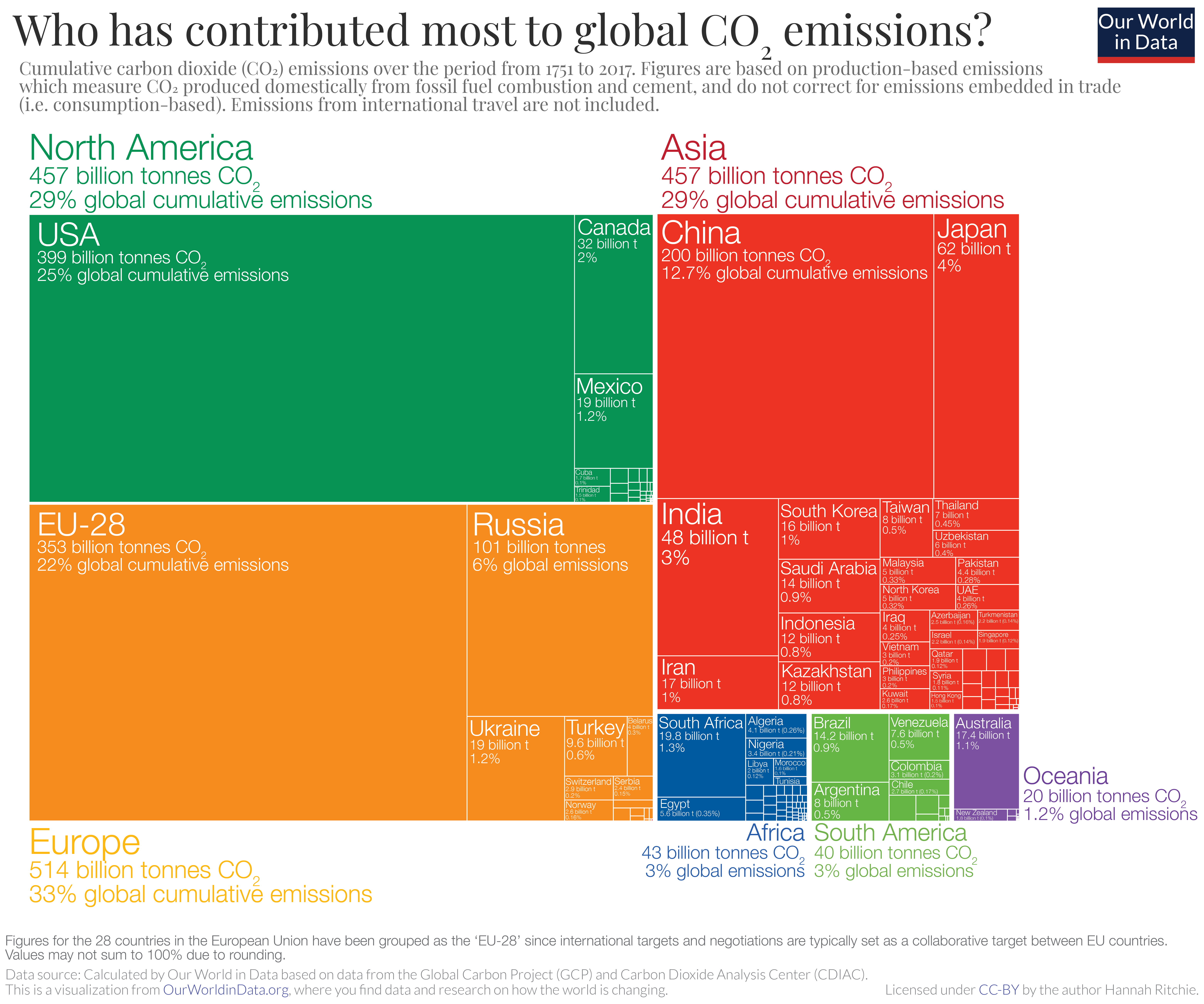
The distribution of cumulative emissions around the world is shown in the treemap. Treemaps are used to compare entities (such as countries or regions) in relation to others, and relative to the total. Here countries are presented as rectangles and colored by region. The size of each rectangle corresponds to the sum of CO2 emissions from a country between 1751 and 2017. Combined, all rectangles represent the global total.
There are some key points we can learn from this perspective:
- the United States has emitted more CO2 than any other country to date: at around 400 billion tonnes since 1751, it is responsible for 25% of historical emissions;
- this is twice more than China – the world’s second largest national contributor;
- the 28 countries of the European Union (EU-28) – which are grouped together here as they typically negotiate and set targets on a collaborative basis – is also a large historical contributor at 22%;
- many of the large annual emitters today – such as India and Brazil – are not large contributors in a historical context;
- Africa’s regional contribution – relative to its population size – has been very small. This is the result of very low per capita emissions – both historically and currently.
All of this data is also explorable by country and over time in the interactive map. By clicking on any country you can see the country’s cumulative emissions over time, and compare it with other countries.
How has each region’s share of global cumulative CO2 emissions changed over time?
In the visualizations above we focused on each country or region’s total cumulative emissions (1) in absolute terms; and (2) at a single point in time: as of 2017.
In the chart we see the change in the share of global cumulative emissions by region over time – from 1751 through to 2017.
Up until 1950, more than half of historical CO2 emissions were emitted by Europe. The vast majority of European emissions back then were emitted by the United Kingdom; as the data shows, until 1882 more than half of the world’s cumulative emissions came from the UK alone.
Over the century which followed, industrialization in the USA rapidly increased its contribution.
It’s only over the past 50 years that growth in South America, Asia and Africa have increased these regions’ share of total contribution.
How has each country’s share of global cumulative CO2 emissions changed over time?
In the final visualization you can explore the same cumulative CO2 emissions as you have seen above but now visualizes by country. Using the timeline at the bottom of the chart you can see how contribution across the world has evolved since 1751. By clicking on a country you can see an individual country’s cumulative contribution over time.
The map for 2017 shows the large inequalities of contribution across the world that the first treemap visualization has shown. The USA has emitted most to date: more than a quarter of all historical CO2: twice that of China which is the second largest contributor. In contrast, most countries across Africa have been responsible for less than 0.01% of all emissions over the last 266 years.
What becomes clear when we look at emissions across the world today is that the countries with the highest emissions over history are not always the biggest emitters today. The UK, for example, was responsible for only 1% of global emissions in 2017. Reductions here will have a relatively small impact on emissions at the global level – or at least fall far short of the scale of change we need. This creates tension with the argument that the largest contributors in the past should be those doing most to reduce emissions today. This is because a large fraction of CO2 remains in the atmosphere for hundreds of years once emitted.3
This inequality is one of the main reasons which makes international agreement on who should take action so challenging.
Who emits the most CO2 today?
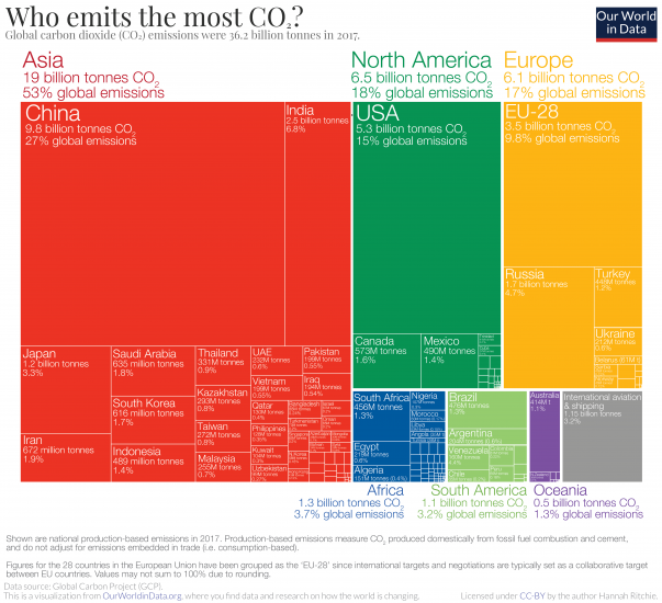
Who emits the most CO2 each year? In the treemap visualization we show annual CO2 emissions by country, and aggregated by region. Treemaps are used to compare entities (such as countries or regions) in relation to others, and relative to the total. Here each inner rectangle represents a country – which are then nested and colored by region. The size of each rectangle corresponds to its annual CO2 emissions in 2017. Combined, all rectangles represent the global total.
The emissions shown here relate to the country where CO2 is produced (i.e.production-based CO2) , not to where the goods and services that generate emissions are finally consumed. We look at the difference in each country’s production vs. consumption (trade-adjusted) emissions here.
Asia is by far the largest emitter, accounting for 53% of global emissions. As it is home to 60% of the world’s population this means that per capita emissions in Asia are slightly lower than the world average, however.
China is, by a significant margin, Asia’s and the world’s largest emitter: it emits nearly 10 billion tonnes each year, more than one-quarter of global emissions.
North America – dominated by the USA – is the second largest regional emitter at 18% of global emissions. It’s followed closely by Europe with 17%. Here we have grouped the 28 countries of the European Union together, since they typically negotiate and set targets as a collective body. You can see the data for individual EU countries in the interactive maps which follow.
Africa and South America are both fairly small emitters: accounting for 3-4% of global emissions each. Both have emissions almost equal in size to international aviation and shipping. Both aviation and shipping are not included in national or regional emissions. This is because of disagreement over how emissions which cross country borders should be allocated: do they belong to the country of departure, or country of origin? How are connecting flights accounted for? The tensions in reaching international aviation and shipping deals are discussed in detail at the Carbon Brief here.
Share of global CO2 emissions by country
In the interactive chart you can explore each country’s share of global emissions. Using the timeline at the bottom of the map, you can see how the global distribution has changed since 1751. By clicking on any country you can see its evolution and compare it with others.
If you’re interested in which countries emit more or less than their ‘fair share’ based on their share of global population, you can explore this here.
The distribution of emissions has changed significantly over time. The UK was – until 1888, when it was overtaken by the US – the world’s largest emitter. This was because the UK was the first country to industrialize, a transition which later contributed to in massive improvements in living standards for much of its population.
Whilst rising CO2 emissions have clear negative environmental consequences, it is also true that they have historically been a by-product of positive improvements in human living conditions. But, it’s also true that reducing CO2 emissions is important to protect the living conditions of future generations. This perspective – that we must consider both the environmental and human welfare implications of emissions – is important if we are to build a future that is both sustainable and provides high standards of living for everyone.
Rising emissions and living standards in North America and Oceania followed soon after developments in the UK.
Many of the world’s largest emitters today are in Asia. However, Asia’s rapid rise in emissions has only occurred in very recent decades. This too has been a by-product of massive improvements in living standards: since 1950 life expectancy in Asia has increased from 41 to 74 years; it has seen a dramatic fall in extreme poverty; and for the first time most of its population received formal education.
Whilst all countries must work collectively, action from the very top emitters will be essential. China, the USA and the 28 countries of the EU account for more than half of global emissions. Without commitment from these largest emitters, the world will not come close to meeting its global targets.
Footnotes
- Carbon dioxide (CO2) emissions from fossil fuel combustion were almost zero prior to 1750. The United Kingdom was the world’s first industrialized nation – and first fossil-fuel CO2 emitter. In 1751 its (and global) emissions were less than 10 million tonnes – 3600 times less than global emissions today. We can conclude that emissions prior to 1750 were very low (and inconsequential to the numbers we compare today). You can find further information on how long historical emissions (dating back to 1751) are estimated here.
- The underlying data sources for annual CO2 emissions data come from the Carbon Dioxide Analysis Center (CDIAC) and the Global Carbon Project. The cumulative figures were calculated by Our World in Data based on these annual estimate sources.
- IPCC, 2013: Climate Change 2013: The Physical Science Basis. Contribution of Working Group I to the Fifth Assessment Report of the Intergovernmental Panel on Climate Change [Stocker, T.F., D. Qin, G.-K. Plattner, M. Tignor, S.K. Allen, J. Boschung, A. Nauels, Y. Xia, V. Bex and P.M. Midgley (eds.)]. Cambridge University Press, Cambridge, United Kingdom and New York, NY, USA, 1535 pp.